White Label Analytics & Reporting
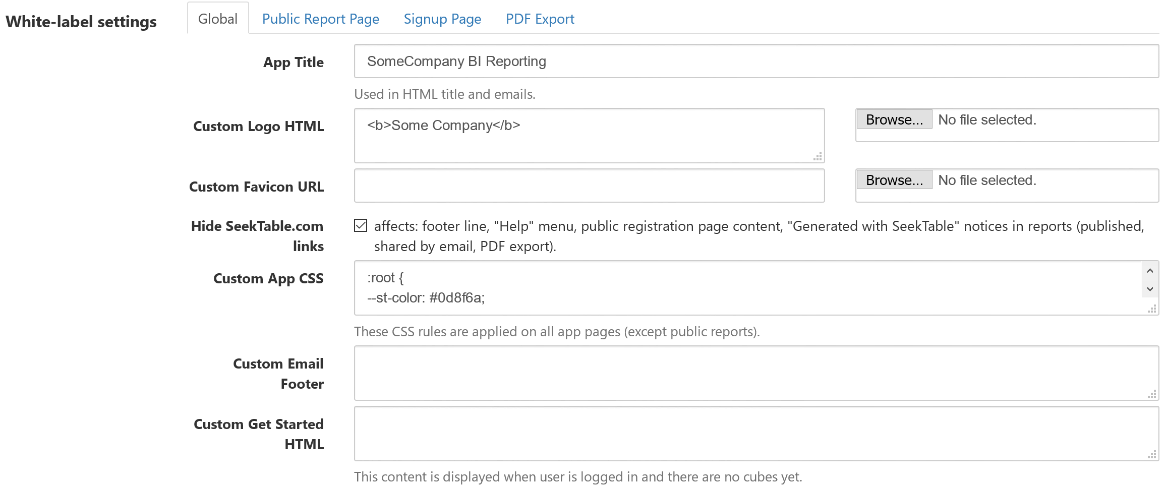
White labeling gives you full control over SeekTable reports (and the app itself) visual appearance. With white label mode you can rebrand and customize SeekTable app to make it appear as if this is your company's own proprietary offering. This is especially important if you embed SeekTable reports because they should look like a seamless part of your own product. Also white-label SeekTable is good as a self-service reporting portal for data intelligence providers and data-services agencies.
White-label app settings are possible only for SeekTable installations (either self-hosted deployment or dedicated managed-by-SeekTable instance) with an active "white-label mode" subscription. If you want to evaluate these capabilities before purchase you can request a free 14-day trial.
- replace app's top-left "SeekTable" logo with your own logo or brand name.
- change "SeekTable" with your brand name in web pages titles (suffix), specify your own favicon.
- hide all links to seektable.com, including "Generated by SeekTable" notice in published reports/dashboards and PDF exports.
- customize visual styles of the app/reports/PDF exports by overriding CSS variables / adding your own CSS rules. You can easily customize light/dark theme colors, default chart colors, change font styles, table's cells spacing etc (see instructions below).
- specify your own content for published report's footer & PDF export page-footer.
- customize (or translate to non-English language) app's UI labels or configure multiple languages.
SeekTable's white-label reporting is good for organizing a portal for self-service analytics where your clients or customers may login and access reports in a secure manner.

How to change SeekTable "brand" color
By default SeekTable uses dark-green color for main-action buttons, active items etc. You can change this color to match your company's logo or brand color by adding this CSS rule into Custom App CSS:
:root {
--st-color: #0d8f6a;
}
How to change UI elements border radius
SeekTable app UI elements use 6px corner radius by default. You can change it to match your corporate design in the same way as app's "brand" color:
:root {
--st-border-radius: 0px; /* square design */
}
Note: published reports/dashboards use a separate CSS, and you can have different border radius for published reports/dashboards by adding CSS rule into Custom Public Report CSS ("Public Report Page" tab):
body.st-public-report {
--st-border-radius: 6px; /* the same as app's default */
}
How to change default chart colors
SeekTable renders charts as SVG images with ChartistJS and this means that chart styles may be customized by adding an appropriate CSS rules. Most typical customization is a change of default chart colors; you can do that globally (for a whole app) simply by overriding CSS variables:
- Go to Admin → System setup → White-label settings
- Add to Custom App CSS chart color variables:
:root {
--st-chart-series-a-color: #5b9bd5;
--st-chart-series-b-color: #ed7c31;
--st-chart-series-c-color: #a5a5a5;
}
SeekTable charts can have up to 15 different colors, you can override all of them or only some of them by specifying an appropriate variable part (fromseries-atoseries-o). -
If you want to override chart colors both inside the app, PDF exports and for published reports/dashboards,
these CSS vars should be specified in the following places:
- Custom App CSS
- Custom Public Report CSS ("Public Report Page" tab)
- Custom PDF export CSS ("PDF Export" tab)
Note: custom colors for the concrete report can be specified in the report builder UI (use icon near Chart selector).
How to change width of left menu / report builder right panel
By default both left menu and report builder panel have width = 200px - this is a good trade-off between items readability and page space used for the report itself. If you have long names for cubes/reports you might want to increase the left-menu width (at least for large-enough screens). To do that simply add a CSS rule that overrides an appropriate CSS variables in the Custom App CSS:
@media (min-width: 1200px) {
:root {
	--st-left-menu-width: 270px;  /* extended left-menu width */
	--st-report-right-panel-width: 270px;  /* extended report builder right panel width */
}
}
How to customize light/dark theme
Both light (default) and dark color schemes are fully determined by CSS variables. This means that SeekTable app colors may be easily customized in the same way as "brand" color or UI elements border radius. You may find these variables defined at the beginning of an appropriate CSS file:
- App styles (Custom App CSS): st.css
- Published reports/dashboards styles (Custom Public Report CSS): publicreport.css
Dark theme variables should be specified in this way:
body.st-color-scheme-dark {
--st-bg-color: #222;
}
How to add a timestamp to PDF exports
In addition to the logo/brand you might want to add a generation date (or a timestamp) to PDF exports. This can be achieved with special tokens in the Custom PDF export footer HTML ("PDF Export" tab):
<span class="date-year"></span>-<span class="date-month"></span>-<span class="date-day"></span>
<span class="date-hours"></span>:<span class="date-minutes"></span>
How to customize SeekTable interface labels
White-label mode allows you to customize app's UI labels Admin → UI localization: for example, "Cube" can be changed to "Dataset" etc. In this way it is possible to switch app's UI to another language or enable multi-language localization.